A hypothetical problem statement that helped Qatar Airways and other Biz make $$$
COMPANY
AirMeals
ROLE
Product Thinking & UI Designer
team
Designer (Me)
Time
Two weeks
200+
Iterations and designs
3
Inbound gigs
Qatar Air
reached out to me for collaboration
Project description
AirMeal is an in-flight food ordering app designed to enhance passenger convenience by allowing users to order meals directly through their mobile devices during a flight. This solution eliminates the need for traditional menu cards and minimizes interaction with flight attendants, reducing wait times and providing more personalized meal options. Insights from frequent flyers revealed two key issues: reluctance to ask for menus due to social discomfort and concerns about the hygiene of physical menu cards, especially post-COVID. AirMeal addresses these concerns by offering a seamless, contactless, and hygienic ordering experience, catering to passengers' dietary preferences with ease.
The challenge
Designing the entire experience for an in-flight food ordering app. Passengers can order food for immediate consumption after placing their orders on the same mobile app during their flight journey.
Process
Conducted market research to understand current in-flight food ordering solutions. Developed initial designs, followed by final designs and motion designs, with a focus on creating a modern, visually appealing, and user-friendly interface.
Flaws in current solutions
Reviewed various airlines’ approaches to in-flight food ordering, identifying gaps and inefficiencies in the existing systems.
Initial Designs
Created the first set of designs, pushing myself to explore innovative solutions and improve upon the initial concepts.
Final designs
Each design element went through multiple iterations to ensure the user experience was optimized, making sure the UX was intuitive and aligned with user needs.
Motion Design
Utilized Figma and Lottie to incorporate motion design into the splash and payment screens, adding a polished, modern visual appeal to the user experience.
Solution
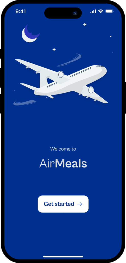
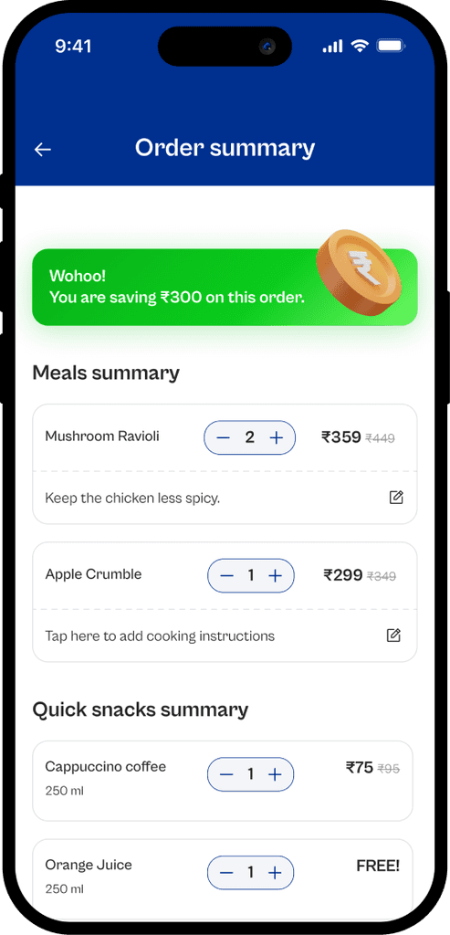
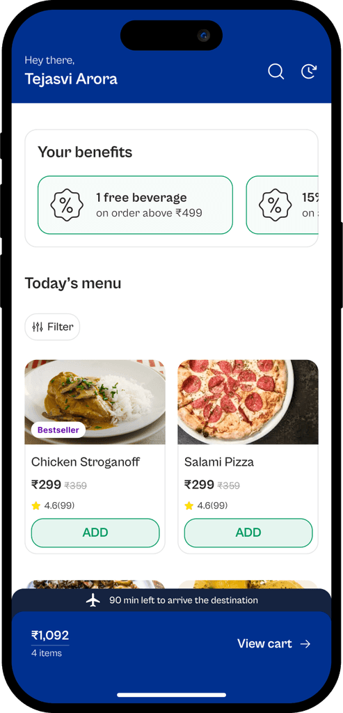
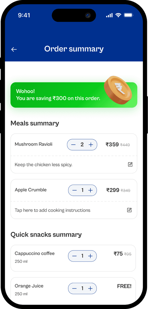
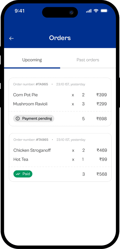
Here is a glimpse of the visuals of AirMeals mobile app.
Results
Although, being a hypothetical case study, I wasnt expecting much but this case study apparaently refleced my problem solving skills and resulted in:
Qatar Airways
The case study and the visuals have been used by the designers at Qatar Airways for their own product design
Multiple job offers
This case study went viral on Linkedin and Medium and resulted in 50K impressions. Eventually, got reached out by a few entrepreneurs in aviation industy to implement this case study in real life.
Persistance
Created more than 200+ screens and went over multiple iterations to make sure the UX is on point with a sweet balance of visuals and motion.
Learnings
Although, the problem statement was hypothetical but the great visuals and approach to the design took me through a lot of places and these are my major takeaways from this project
Embracing Critiques
Getting comfortable with receiving feedback, even when it’s not what you expected, is essential for growth. It’s okay if I don’t get the response I hoped for right away. What matters most is my willingness to learn and grow, which always brings out the best in my design process.
Challenging Conventional Design Norms
I realized that it’s not always necessary to follow traditional design patterns. For example, instead of the typical Bottom NavBar with four icons, I designed it to show the cart value and flight duration, which made more sense for the user experience. I’ve learned that thinking outside the box often leads to more practical solutions.
Not Falling In Love With My Designs
I’ve also learned not to fall in love with my designs. The moment I get too attached is when I stop looking for ways to improve. By staying open to change and constantly seeking ways to refine my work, I can ensure that the design continues to evolve and better serve its users.
